
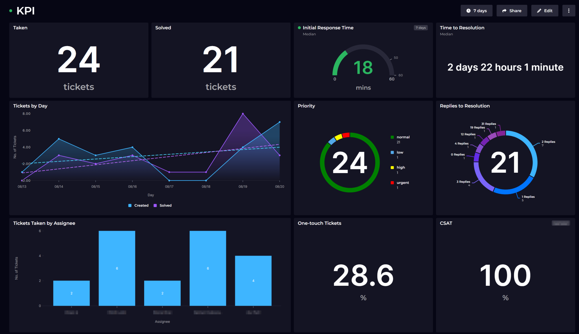

A dashboard is not a reporting feature. It is a promise that someone can look at a screen for two minutes and leave knowing what to do. Most of the dashboards I have been asked to rebuild failed that test, and almost none of them failed for technical reasons.
Build for the decision, not for the data
The usual way a dashboard gets specified is that someone lists the fields being collected and asks for them to be charted. What comes back is accurate, comprehensive, and useless, because it answers a question nobody asked.
The better starting point is the decision. A programme manager checking coverage before a funder call needs to know which districts are behind and by how much. A finance lead needs to know whether spend is tracking to plan and where the variance sits. A field supervisor needs to know which of their enumerators has not submitted since Tuesday. Those are three dashboards, not three tabs of the same one, and each of them can be answered with a handful of numbers.
Once you know the decision, the layout writes itself. The number that triggers action goes first and large. The breakdown that explains it goes second. Everything else goes behind a link.
Latency is a design constraint
People trust a dashboard in proportion to how current they believe it is. If the underlying data arrives from field devices that sync intermittently, the dashboard is showing a partial picture and it should say so, plainly, near the number rather than in a footnote.
I put the last sync time and the count of devices reporting on every operational dashboard I build. It costs one line and it prevents the single most damaging failure mode, which is a manager acting on a low figure that is low because half the devices have not checked in yet.
Alerts earn their place or they get switched off
An alert that fires often becomes noise within a fortnight, and after that the whole system loses credibility. The threshold that matters is not the one that is statistically interesting, it is the one that would change what somebody does that day.
In practice that means fewer alerts than clients initially ask for, tied to conditions they can actually act on: a site that has reported nothing for three days, a stock level below the reorder point, a data quality flag on more than a set proportion of submissions. Each one should name who is responsible for responding, because an alert addressed to everybody is addressed to nobody.
Exports are not an afterthought
In monitoring and evaluation work the export is often the actual deliverable. Reports get pasted into board packs, submitted to funders, and reconciled against other systems. If the export is a raw dump of the database, somebody spends a day a month cleaning it, and that day is a real cost you have handed to your client.
Build the export the way the recipient needs it. Column headings in the language of the programme rather than the schema. Dates in one consistent format. Codes resolved to labels. A cover sheet with the reporting period and the filters applied, so a spreadsheet found six months later can still be identified.
Access control is part of the reporting design
Who can see which rows is a reporting question as much as a security one. A district supervisor seeing national figures will benchmark against them, which may be exactly what you want or may be exactly what the client wants to avoid. Aggregate views can leak individual records when a filter narrows to a single case, which matters a great deal when the records concern people.
Decide the visibility rules with the client at design time and write them down alongside the wireframes. Retrofitting row-level access into a reporting layer that assumed everyone sees everything is one of the more expensive changes you can be asked to make.
The handover test
The measure of a reporting system is not whether it works on launch day. It is whether it still works eighteen months later, when the person who commissioned it has moved on and a new analyst needs to add a metric.
That means documented definitions for every figure on the screen, so nobody has to guess what counts as an active site. It means the query logic living somewhere a technical person can read it rather than buried in a visualisation tool. And it means a short written handover of what to do when a number looks wrong, because eventually one will.
None of this is glamorous work. It is the difference between a dashboard that gets opened every Monday and one that gets replaced.